Next level label design
There are three big creative challenges with labelling food and drink products. The first is ‘jump-outability’ – does the product attract the target consumer and encourage them to pick it up? The second is ‘personality’: does it say, ‘I’m like you. I can fit into your life and we’d be great together’? The last is ‘authority’: does it give the consumer confidence that they’ll like using the product, or being seen using it?
Working with Sharp’s, our brief was to create a label for a new Belgian tripel style beer to be served exclusively at the Food Magazine Reader Awards. Although traditional in style the beer had been brought bang up to date with orange peel, oats and opal hops – hence the name Tripel O.
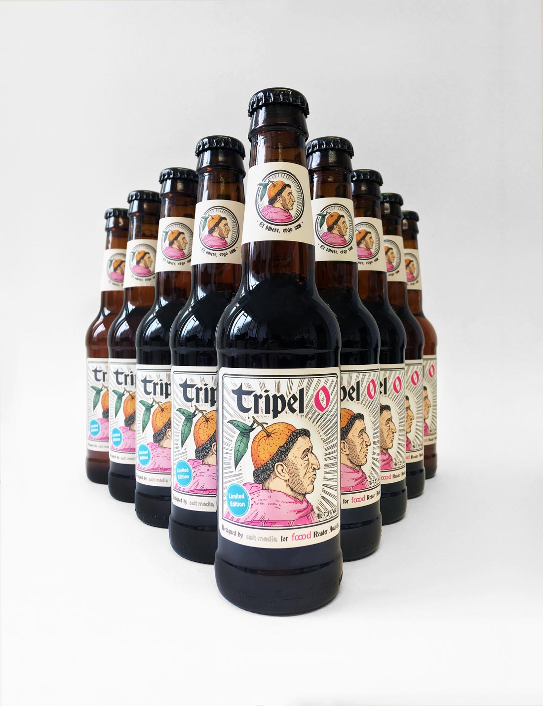
Our creative team re-imagined how the beer might have been developed deep in a Belgian monastery, by cloistered monks who have sworn a vow of silence to preserve the centuries-old, secret brewing method.
The threat of eternal damnation would be nothing compared to the dishonour of revealing the secret of Tripel O. Happily, they’ve kept it under their orange-inspired hats.